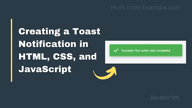
Creating a toast notification in HTML, CSS, and JavaScript is a simple and effective way to display temporary messages to users. Below is a step-by-step guide to creating a basic toast notification.
1. HTML Structure
The HTML defines the structure of the toast notification and the button to trigger it.
<!DOCTYPE html>
<html lang="en">
<head>
    <meta charset="UTF-8">
    <meta name="viewport" content="width=device-width, initial-scale=1.0">
    <title>Toast Notification</title>
    <link rel="stylesheet" href="styles.css">
    <!-- Font Awesome for Icons -->
    <link rel="stylesheet" href="https://cdnjs.cloudflare.com/ajax/libs/font-awesome/6.0.0/css/all.min.css">
</head>
<body>
    <!-- Button to show the toast -->
    <button id="showToast">Show Toast</button>

    <!-- Toast Notification -->
    <div id="toast" class="toast">
        <div class="toast-icon">
            <i class="fas fa-check"></i> <!-- Check icon -->
        </div>
        <div class="toast-content">
            <p class="toast-message">Success! Your action was completed.</p>
        </div>
        <div class="toast-loader"></div> <!-- Bottom loader -->
    </div>

    <script src="script.js"></script>
</body>
</html>
Explanation:
- Button: The button with the ID
showToastis used to trigger the toast notification. - Toast Container: The
divwith the IDtoastis the main container for the toast notification.- It contains:
- A check icon (using Font Awesome).
- A message (
toast-message). - A progress bar (
toast-loader).
- It contains:
2. CSS Styling
The CSS styles the toast notification, button, and progress bar.
/* styles.css */
body {
    font-family: Arial, sans-serif;
    display: flex;
    justify-content: center;
    align-items: center;
    height: 100vh;
    margin: 0;
    background-color: #f4f4f9;
}

button {
    padding: 10px 20px;
    font-size: 16px;
    background-color: #007bff;
    color: white;
    border: none;
    border-radius: 5px;
    cursor: pointer;
    transition: background-color 0.3s ease;
}

button:hover {
    background-color: #0056b3;
}

.toast {
    visibility: hidden;
    min-width: 300px;
    background-color: #4caf50; /* Green background for success */
    color: white;
    text-align: left;
    border-radius: 5px;
    padding: 15px 20px;
    position: fixed;
    z-index: 1000;
    top: 20px; /* Position at the top */
    right: 20px; /* Position at the right */
    opacity: 0;
    transition: opacity 0.5s, visibility 0.5s, top 0.5s;
    display: flex;
    align-items: center;
    box-shadow: 0 4px 10px rgba(0, 0, 0, 0.2);
}

.toast.show {
    visibility: visible;
    opacity: 1;
    top: 30px; /* Move slightly down when visible */
}

.toast-icon {
    font-size: 24px;
    margin-right: 15px;
}

.toast-content {
    flex: 1;
}

.toast-message {
    margin: 0;
    font-size: 14px;
    line-height: 1.5;
}

.toast-loader {
    position: absolute;
    bottom: 0;
    left: 0;
    height: 4px;
    width: 100%;
    background-color: rgba(255, 255, 255, 0.3);
    border-radius: 0 0 5px 5px;
    overflow: hidden;
}

.toast-loader::after {
    content: '';
    display: block;
    height: 100%;
    width: 100%;
    background-color: white;
    transform: translateX(0); /* Start from the left */
    animation: loader 3s linear forwards;
}

@keyframes loader {
    0% {
        transform: translateX(0); /* Start from the left */
    }
    100% {
        transform: translateX(100%); /* Move to the right */
    }
}
Explanation:
- Button Styling:
- The button is styled with padding, background color, and hover effects.
- Toast Styling:
- The toast is initially hidden (
visibility: hiddenandopacity: 0). - It is positioned at the top-right corner (
top: 20pxandright: 20px). - When the
showclass is added, it becomes visible and slides down slightly (top: 30px).
- The toast is initially hidden (
- Loader Styling:
- The loader is a thin bar at the bottom of the toast.
- The
::afterpseudo-element is used to create the animated progress bar. - The
@keyframes loaderanimation moves the progress bar from left to right by animating thetransform: translateXproperty.
3. JavaScript Functionality
The JavaScript handles the logic for showing and hiding the toast.
// script.js
document.getElementById('showToast').addEventListener('click', function () {
    showToast();
});

function showToast() {
    const toast = document.getElementById('toast');
    toast.classList.add('show');

    // Reset the loader animation
    const loader = toast.querySelector('.toast-loader');
    loader.style.animation = 'none';
    void loader.offsetWidth; // Trigger reflow to restart the animation
    loader.style.animation = null;

    // Hide the toast after 3 seconds
    setTimeout(function () {
        toast.classList.remove('show');
    }, 3000); // Matches the loader animation duration
}
Explanation:
- Event Listener:
- When the button is clicked, the
showToastfunction is called.
- When the button is clicked, the
- Show Toast:
- The
showclass is added to the toast, making it visible.
- The
- Reset Loader Animation:
- The loader animation is reset by temporarily removing and reapplying the
animationproperty. This ensures the animation restarts every time the toast is shown.
- The loader animation is reset by temporarily removing and reapplying the
- Hide Toast:
- After 3 seconds, the
showclass is removed, hiding the toast.
- After 3 seconds, the
How It All Works Together
- User Clicks the Button:
- The
showToastfunction is triggered.
- The
- Toast Becomes Visible:
- The
showclass is added to the toast, making it visible and sliding it down slightly.
- The
- Loader Animation Starts:
- The progress bar animates from left to right over 3 seconds.
- Toast Disappears:
- After 3 seconds, the
showclass is removed, hiding the toast.
- After 3 seconds, the
Key Features
- Progress Bar:
- Animates from left to right in reverse (shrinking effect).
- Toast Position:
- Appears in the top-right corner.
- Animation Reset:
- The loader animation restarts every time the button is clicked.
This code is clean, modular, and easy to customize for different use cases. Let me know if you have further questions! 😊
